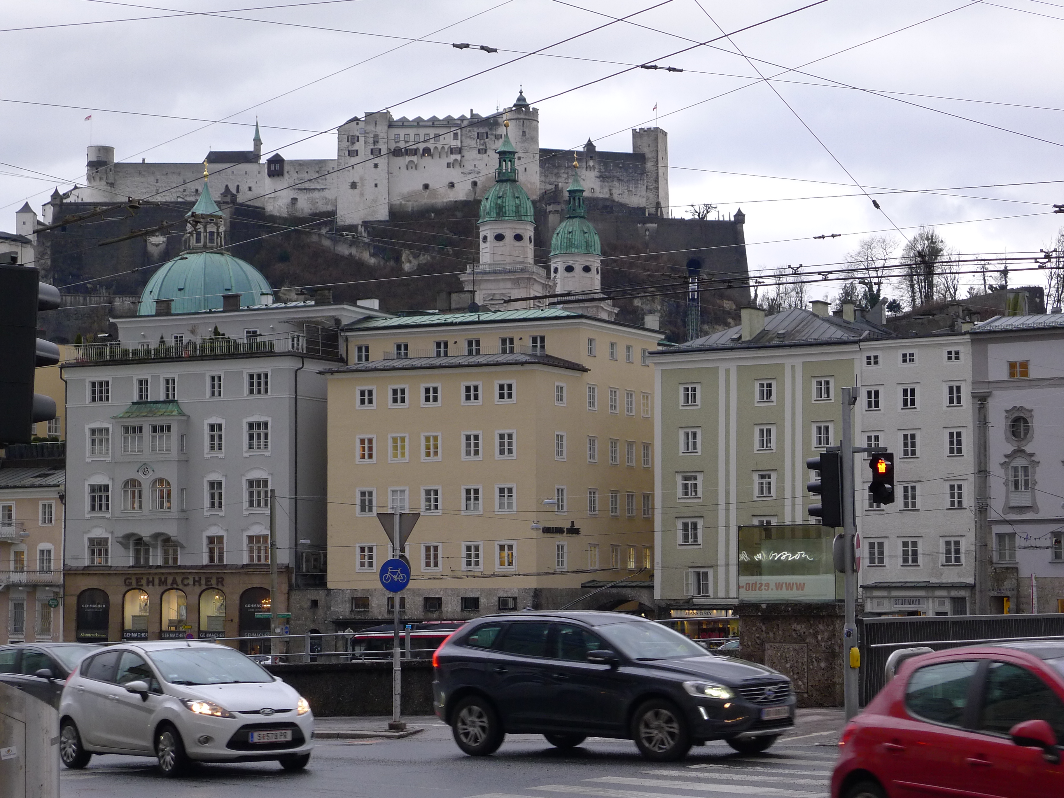
My interest was piqued a couple of weeks ago when a friend, Lisa Round, texted me an image of the cover of the Kansas City Business Journal. Taking up most of the cover was a drawing of an airliner and this headline: “What’s next for KCI? And how it compares to America’s best-run airports”
Inside, the paper devoted seven and a half pages — more than 25 percent of the newspaper — to an assessment of the nation’s major airports, including KCI.
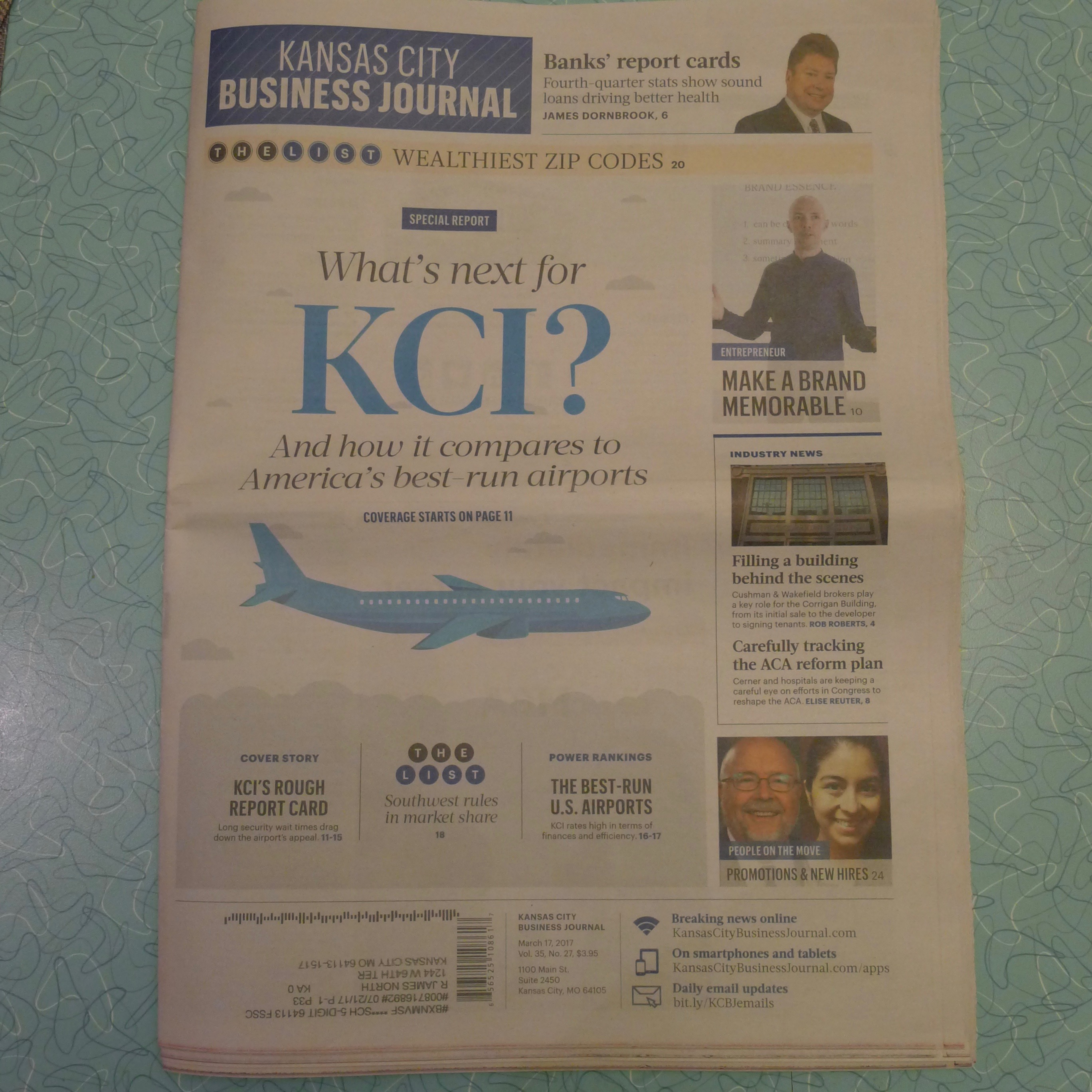
The assessment was a collaborative project done by various business journals in the American City Business Journals chain.
I don’t have a print or online subscription to the Biz Journal, so I bummed a copy from a neighbor who subscribes.
I was expecting a lot of insight, but overall I was disappointed. Essentially, it was a mishmash of statistics and graphics.
The most interesting and understandable part was a “report card” rating the convenience of major U.S. airports. Atlanta’s Hartsfield-Jackson International Airport and D.C.’s Reagan National Airport got the only “A” ratings…KCI got a D-plus, which sounds about right to me.
The convenience rankings were based on factors such as parking, access to public transportation, concentration of retail stores and restaurants, and average wait time in security lines.
Surprising to me, Kansas City’s average security-line wait time was nearly 29 minutes. I can’t recall the last time I had a long wait to go through security; that part of KCI doesn’t bother me at all. At any rate, KCI’s the 29-minute average wait time was third worst, behind only the Washington Dulles and Buffalo Niagra airports.
One factor that wasn’t considered in the convenience rankings was distance from parking lots to gates or from curb to gates. That, of course, is the single biggest convenience factor Kansas City area residents are concerned with…As a result, the “convenience” ratings weren’t particularly relevant insofar as area residents’ perception of KCI.
Another factor that contributed to the mishmash was the identification of airports by their three-letter codes, such as MCI for Kansas City International and MDW for Midway in Chicago. Those codes are not always clear, as we all know, and they sowed confusion in several graphics.
For example, a graphic ranking the most profitable airports put New York’s JFK (clear enough) No. 1. Ranked No. 2 was an airport with the code EWR. Now, even though Patty and I flew to Europe last month out of Newark International Airport, I had to Google EWR to find out that is Newark’s code.
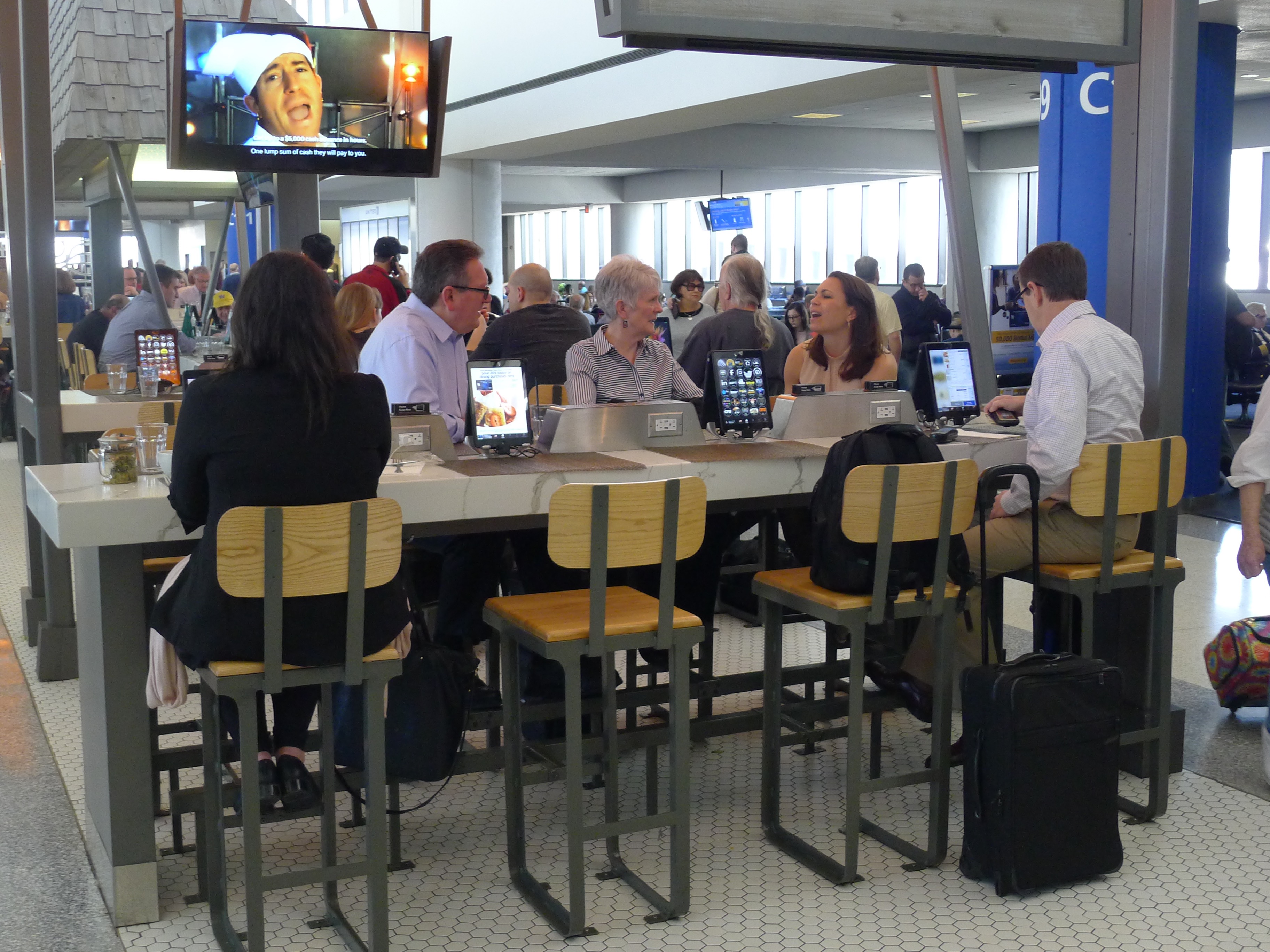
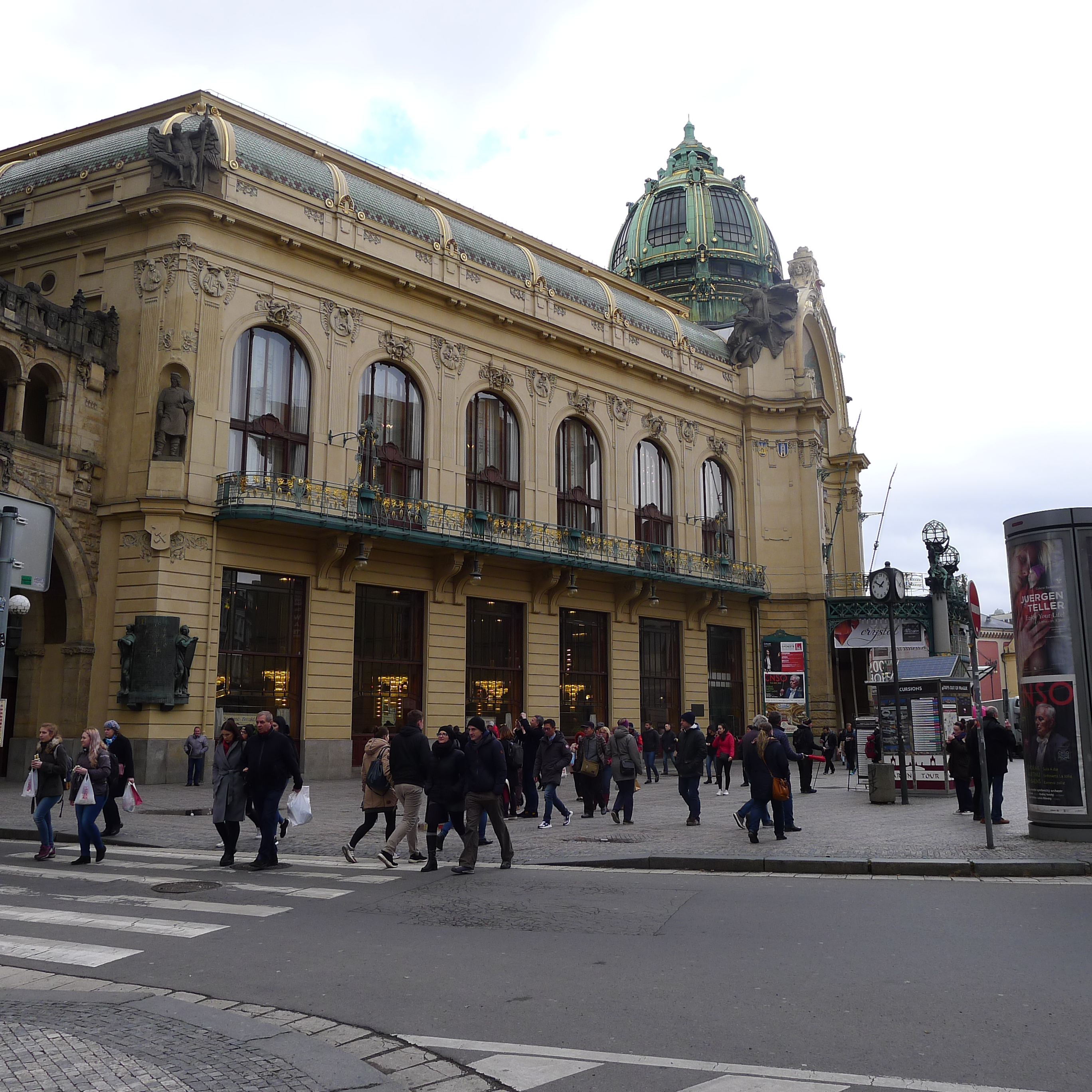
And, by the way, Newark (below) is a fantastic airport. It’s open, airy and inviting, and several dining areas provide tablets or iPads for every customer to order food and drinks.
The most confounding thing in the Biz Journal’s report, however, was a graphic listing the “Top 25 Airport Power Rankings.”
Factors considered in that category included enplanements per employee, revenue per employee and growth patterns in operating income, revenue and debt. Unfortunately, the chart was indecipherable. I found it impossible to go down the list of airports, then read across the graphic and try to figure out why San Jose was No. 1, Los Angeles was No. 2, San Antonio was No. 3, etc.
At any rate, KCI was ranked No. 11. Sounds good, I guess…For the record, San Jose International was ranked No. 1, but I couldn’t tell you why.


You must be logged in to post a comment.